For the most part, companies always think that brochures are actually dead and long gone. There are many perks in handing out brochures as told in the previous blog entry. Brochure lets you connect with your customers and you can actually create a more personal approach depending on how you assess your kinds of customers. You will be able to explain your products more with a more appropriate tone in order to convince them to invest in your products.
However, that doesn’t mean that you can simply neglect the design and the materials used for the brochure since you’ll rely on your charisma – the design and the entire output is actually a show of your professionalism and your eye for design. It’s the best way to make a first impression to your customer and it will definitely get their attention.
Here are a couple of tips you can bear in mind whenever you need to design your brochure:
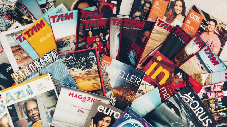
- Adding the media. Adding relevant photographs will boost its attractiveness, and ideally, these photographs shouldn’t be one of the images you can openly search in the internet. These photographs should be freshly taken in your company and should be uploaded in high definition. It will be your effective marketing strategy to show off your services or establishment to customers – it’ll be like a brief preview. You should always ensure that the photographs are in high resolution.
- Full bleed. Have you noticed that some brochures have white borders in the corners that are simply tacky and annoying? It’s actually better to get rid of them and spread your image throughout for a more professional look. It also helps that you work with a good printing company to get the best results you imagine. Plus, it also make your brochure look more professional and sophisticated – something you want your customers to see.
- Choosing your font and text. All the text you plan to put should be subtle and relevant to your service – loads of text actually discourages people to read more about it and just skim through it. It will eventually be ignored and people won’t be interested anymore. However, if you strategically place information in proper locations – front for selling inputs, middle for more information about your company and services, and the back would be the contact details. As for fonts, the simpler it is, the better – as tackled in the last blog. Carefully select what information you should share with the customers and you can fill in the rest when you’re presenting your product in conversation.
- Choose the best colour scheme. Every colour lets you feel emotion, regardless if it’s happy or not – but the best way to choose a colour for your organization is to choose calming hues. Most corporations choose neutral or calming colours as their main hues – mostly it shows sophistication and professionalism as well. Going for monochromatic or balanced schemes are the common trend for most professional companies, and it has proven to be effective in print.
- Size. Understanding what kind of services you offer and the amount of input you need to print, the size should be carefully considered. If you intend to put your price list, you need an accordion brochure to save space and money. Cutting your paper in half means you can print more copies, but it all depends on the amount of text you have.

RICHARD NASSIF
 1300 483 455
 0418 260 940
 132 Marsden St, Parramatta
 www.rnprinting.com.au
 richard@rnprinting.com.au
-
COMPLETE PRINTING SOLUTION


