From the thickness of the lines to what colour to primarily use when editing, you should be able to know what suits the theme and photo better. As if you’re a chef and these softwares are your ingredients, whipping out an excellent dish will never be a surprise for you. Knowing your way around can’t be learnt overnight, you need practise and study to achieve a certain level you desire. Here, you will learn easy design tips to make you feel confident with your works of art:
Grid. It exists for a reason – to make sure you don’t go overboard or get uncanny crooked designs. You may not see it now, but it’s still there keeping objects and signages in bay to avoid weird designs. It also makes your design look more professional and cleaner – something you want people to remember whenever they open and scan a few pages of your magazine.
Besides, put yourself in the shoes of your readers and imagine if you would read an article with crooked and tacky design. It basically keeps you at bay in design.
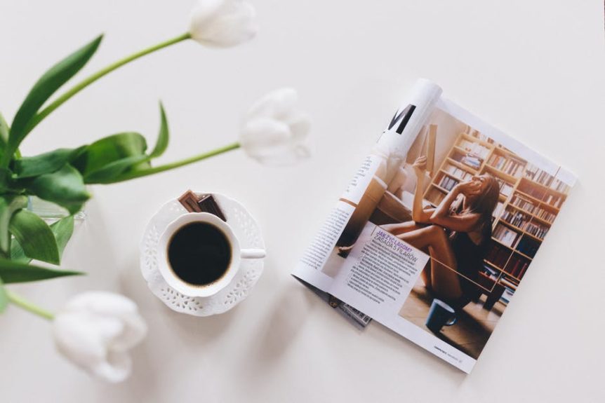
Focal Point. No one wants to look at a magazine with tiny font and no pictures to look at to – that’s why you need a photo. Not just random photo, obviously it has to be related to the topic. Perhaps make it bigger to show emphasis on that specific photograph and effectively show what you want to convey to your readers.
Aside from that, maybe you should also remove distractions from the photo – getting rid of the unnecessary items and people at the back can help your reader to understand where the focus is. It acts as a form of attraction for readers – get them curious what the photo is for then they would read the rest later on.
Balance. Like everything in this world, there is balance. A balance of milk is to cereal, cheese is to macaroni, and soil is to plant – everything is ruled with balance. Like in layout, you should keep in mind of the existence of balance in order to keep things tidy and neat. Imagine pasting every photo without any regard to spacing and size, won’t that make it an awful rendition of Picasso’s style?
But with balance – proper spacing of the pictures and font size, you can achieve a certain level of professionalism and credibility in your magazine. Aside from that, it creates a certain inner peace while looking at it – no mismatched font size and crooked photos to think of.
Rule of thirds. This is probably the only rule you should never ever break – framing your photograph within the three rows and columns. With your whole photo inside, you can now highlight your subject by aligning the four dots where lines meet and the supporting elements. This makes you realise what to mainly focus on while taking the picture or editing it.
It creates a certain clarity for the readers when the images are adjusted accordingly. They will be able to spot the focus right away and understand what are the supporting details.
RICHARD NASSIF
 1300 483 455
 0418 260 940
 132 Marsden St, Parramatta
 www.rnprinting.com.au
 richard@rnprinting.com.au
-
COMPLETE PRINTING SOLUTION


