The Beauty of Minimalism
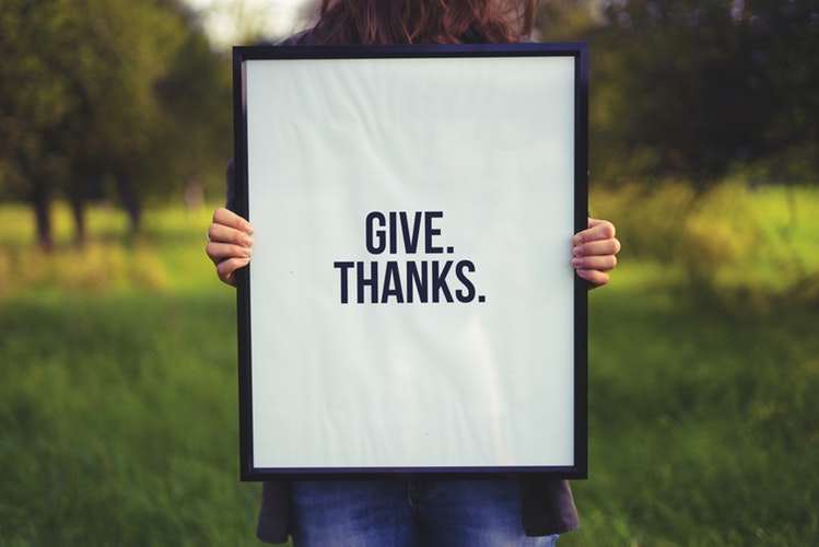
Nowadays, people enjoy designs that are simple, yet it imbues sophistication and class. May it be from labels to planners you hand out to clients, there’s always a feeling of professionalism and beauty for simpler designs. Minimalism can be found in various forms of media even – videos are more elegant when there are lesser effects and photographs look better in small retouches. People nowadays enjoy minimalism, and it’s something most graphic designers yearned and are glad for.
Beautiful fonts can be seen left and right – from cursive to bold sans that seem to hook you right in. For restaurants, it has become a trend to use simple fonts and designs for menu and even signboards to attract customers. The minimalist approach in designs makes the restaurants or brands feel like it’s more classy and dignified.
What is Minimalism?
Minimalism has been defined as simple – all the necessary items and subjects are put there, whatever design are added are purely for functionality and nothing more. Common colours chosen are usually the trio of white, black, and grey. But for other colours, pastel hues or slightly darker jewel tones are used to emphasise the text and such. Most of the time, only one font is used throughout the entire design, and the fonts are emphasised through size and bold fonts.
Most minimalist designs cater to more space and usually occupies the center of the field. They focus on the convenience of the customer in order to divert their attention to where it was needed – quick and easy interaction means a happy customer. Same goes for websites and online adverts, the simpler it is, the more customers will choose it over a complicated service that they possibly don’t understand half of the time.
Why Minimalism?
Minimalism is practical – meaning it’s so simple to design and interact with it that customers won’t have to ask help. They’re also foolproof since it was designed mainly for content and no additional designs or options to complicate the interaction. As for designs for print, it’s easier to see where the main focus should be and it will save the viewers and readers a lot of time.
The minimalist theme goes well with anything – from restaurants to corporate brochures. It shows how the designs are more into convenience as well as fast understanding for most readers or clients. Since there’s less content, it’s faster to internalize. Besides, you save more because of the simple design as well as achieve a better kind of print – because it’s mainly just text.


 1300 483 455
 0418 260 940
 132 Marsden St, Parramatta


