Some of the most nefarious graphic design mistakes your team can make are those you actually don’t see. At least, not until you finally start printing and realize you have created a Frankenstein’s monster instead of a Picasso.
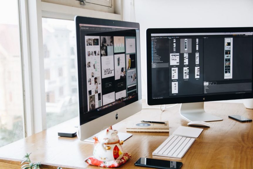
Most of this stems from an unexpected side effect of digital image creation. Novice graphic designers often emphasize on how it looks on the screen or mostly just on a website. They have an unfortunate tendency to not look further and how a design will appear on paper.
Now, that’s not to say you should go back to drawing/painting everything by hand! Rather, it means you should always look below the surface of a design piece before officially sending it to the printers. Some of these don’t even have to do with the design itself but even the way files are saved and how objects are layered. These include well-known issues such as:
1. Misusing tools like bleed.
Don’t be fooled by photo editing tricks until you look up the original purpose of the tools that a said ‘trick’ uses. A famous example is Bleed. The only purpose of bleed is to allow enough room in your design to stay consistent without any whitespace possibly appearing on the finished product.
Anything outside of this is absolutely out of the question. This goes even if you are designing cards with unique shapes. The bleed space is not part of what you are supposed to see. Full stop!
The same goes for when you are cropping an image. Always give allowance to bleed space and don’t try to crop around the edges too thinly.<?p>
2. Designing icons that don’t transition well.
A key feature in a top-of-mind brand is that it uses a logo that remains consistent regardless of size or medium (or even the passage of time). Unfortunately, some icons fall short of even the first transition by proving too detailed or too cumbersome to resize.
Always adopt more than one size perspective when you are still on the drawing board. Look at Mickey Mouse for an excellent example. He is an icon that can be fully detailed in his animated form or simplified into the famous three circles.
Another role model would be the Nike logo. It is simple, recognizable (even without its famous “Just Do It” tagline) and can easily fit anywhere from large billboards to the smallest shoebox. Don’t limit your creativity to one icon on the canvas but how that icon can travel!
3. The wrong resolution for the wrong size of print.
When you are constantly zooming in and out, there is a tendency to forget about the actual size of the finished product. Sometimes the most minute details need not matter if you are printing the image on a very small card.
In contrast, a large poster would not only require a higher resolution but it will also magnify any poor qualities of an image has that were hidden by the size. Make sure your graphic designers always keep proportion and resolution at the top of their minds when detailing an image.
4. Using a single format instead of several.
It bears repeating that certain types of file images are better for print than for digital displays (and vice-versa). For example, images that features sharp and geometric shapes (like those on logos) are better saved using the formats of vector graphics editors (e.g. PDF, VML SVG etc).
On the other hand, if you have a design that makes heavier use of actual photographs or even just photo-realistic images, then you need to start properly juggling between JPEG and TIFF. Know which one is a better fit for the print you are trying to accomplish.
Sometimes you can be so impressed by how a graphic looks on screen and you are excited to send it to the printers. Hopefully, this list of unseen errors will help you avoid a costly mistake. It is not about just how a design looks but also about the technical details and its creation.


 1300 483 455
 0418 260 940
 132 Marsden St, Parramatta


