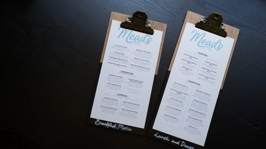
You may choose not to believe it, but some of the best marketing strategies is to amp up the design in terms of menu and of course, the overall interior. But honestly, menus take a larger role in the restaurant and a bigger role lands on design. It doesn’t go as deep as astrological repositioning and feng sui like maybe some restaurants believe, but it actually it’s not that hard. Proper design is all it takes and of course, the comfort of your customers as well.
From spacing to font, each choice is crucial if you want your customers to order what you want them to order, you need a deeper understanding of psychological habits humans do – even basic activities. But you don’t have to be a psychologist to be able to develop the ultimate menu, here are the tips you can bear in mind while designing your menu:
- Right Patterns. There’s more to it than just randomly placing your items in the menu – there’s a pattern. The common misconception about people is their reading habits – most restaurants think that customers would go for the upper righthand corner of the page and order their specialties. However, customers actually read it as a book since that’s how they have been trained and got used to – so the best should be on the left corner.
- Proper sections. Divide your dishes carefully and don’t overcrowd the section and confuse the customers. It’s actually discouraging them for looking at your menu and it will make them just order the first thing they see. Categorising your menu properly will be a breeze for them and it will be easier for them to look back into it if they need to compare dishes. After all, the comfort and convenience of your customer are a few things you need to keep in mind while designing the menu.
- The Right Font. Like in all written forms, the font is a vital piece. Why make a menu if you choose one of those horrid fonts that no one can seem to read? Choosing a font can be tricky – sometimes it tears you from aesthetic to ensure your customer’s convenience. The aesthetic can be thrown, but the visibility of the words you put in the menu is important – that’s why you have a menu in the first place!
- Choose Colours Carefully. You need to consider the theme of your restaurant, the comfort of your customers, as well as creating a mood for dining. The best colour schemes are a combination of warm colours – red, orange, and yellow. These colours are also known to promote hunger – so the hungrier they are, the more they order!
- Too Much Photos is a No No. Photos of the dishes are well appreciated, but honestly, it’s not as ideal as you think it is. Too much photos in the menu will make your customer think your dishes are cheap – since in comparison, the high-end menus never needed photographs to assure their clients that their food is good – a simple description, the name, and the price are all they need.
- Pour Creativity in to it. You may have noticed that some restaurants go for a minimalist design and some go overboard – depends on your theme. If you are a 5-star restaurant, your menu should be simple and direct to the point, however, if you are a Las Vegas inspired restaurant – there should be a lot of neon colours, cowboys, slot machines, and a lot more. But it’s important to consult a professional graphics designer before printing them fully in order to avoid regrets.


 1300 483 455
 0418 260 940
 132 Marsden St, Parramatta


